
I still remember standing in the middle of my first solo design client’s living room, surrounded by fifty different swatches of “eggshell” white, feeling like I was losing my mind. It was a humid July afternoon in Savannah, and the air was thick with the smell of fresh sawdust and expensive floor wax, but all I could focus on was the mounting panic of making a mistake. I realized then that the design industry loves to make things unnecessarily complicated, acting like you need a PhD just to figure out how to choose a color scheme that doesn’t make your walls look like a hospital hallway.
I’m not here to throw expensive terminology or high-end designer secrets at you. Instead, I want to give you the real, hands-on guidance I wish I’d had back when I was just starting out with my first set of tools. We’re going to skip the fluff and dive straight into the practical, tried-and-true methods that actually work in a real home. By the time we’re done, you’ll have the confidence to pick a palette that feels uniquely yours—without the headache.
Table of Contents
Mastering Color Theory for Interior Design With Ease
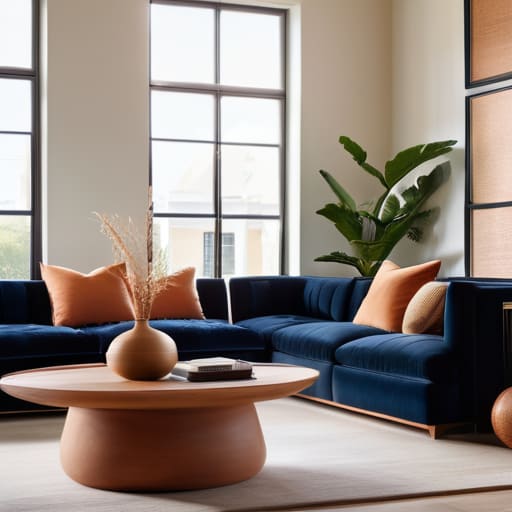
Now, I know what you’re thinking—”Color theory? That sounds like something I left behind in my college studio days at SCAD!” But I promise, it’s way less intimidating than it sounds. Think of it less like a math equation and more like a recipe for your home. When we talk about color theory for interior design, we’re really just talking about how different hues play together to create a certain “vibe.” For instance, you can use complementary color combinations—like a deep navy paired with a soft terracotta—to create a space that feels energetic and intentional rather than just accidental.
Another thing I love to play with is the balance between warm vs cool color palettes. If you’re looking to make a cozy reading nook feel like a warm hug, lean into those sun-drenched yellows and soft peaches. But, if you want your bathroom to feel like a crisp, refreshing spa, those cool blues and greens are your best friends. It’s all about how those colors make you feel when you walk into the room. Don’t be afraid to experiment; your home is your playground!
Finding Harmony Through Complementary Color Combinations
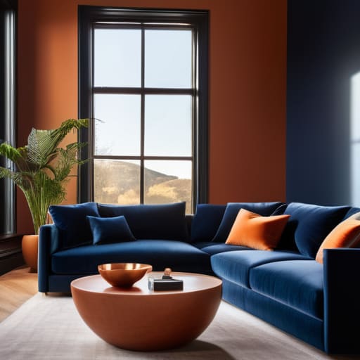
Now, let’s dive into one of my absolute favorite ways to add some serious “wow” factor to a room: complementary color combinations. If you look at a color wheel, these are the pairs that sit directly across from one another—think a deep, moody navy paired with a bright, sunset orange, or a forest green sitting alongside a soft terracotta. Because these colors are opposites, they create a natural tension that makes both hues pop! It’s a fantastic way of creating a cohesive room aesthetic that feels intentional and high-energy rather than just scattered.
However, I’ll let you in on a little designer secret: you don’t want to go full “circus mode” by using both colors in equal amounts. That can get overwhelming really fast! Instead, I love using a dominant color for the big stuff—like your sofa or walls—and then using the complementary shade for those smaller, punchy accents like throw pillows, a ceramic vase, or even a piece of vintage art. This balance keeps the space feeling sophisticated and grounded while still letting your personality shine through.
My Secret Sauce: 5 Pro Tips for Nailing Your Color Scheme
- Start with your “anchor” piece. Before you even touch a paint swatch, look at that vintage rug you just rescued or that velvet sofa you love so much. Use those existing colors as your foundation so your new palette feels like it actually belongs in the room!
- Don’t forget the 60-30-10 rule. It sounds a bit technical, but it’s a total lifesaver! Aim for 60% of a dominant color (usually your walls), 30% of a secondary color (think upholstery), and a 10% pop of an accent color to keep things exciting.
- Test your samples in your actual home. I know, I know, it’s tempting to just pick the prettiest swatch at the store, but lighting changes everything! Grab a few samples and watch how they shift from morning sunlight to cozy evening lamp glow before you commit.
- Think about the “vibe” before the color. Do you want a room that feels like a big, warm hug, or something bright and energizing for a morning coffee ritual? Let the mood guide your choice—colors have a huge impact on how we actually feel in a space.
- Layer in some texture to keep things from looking flat. If you’re going with a monochromatic scheme (my personal favorite for a sophisticated look!), use different materials like linen, wood, or even a bit of hammered metal to add depth and interest.
Quick Tips to Keep in Your Toolbox
Don’t feel like you have to get it perfect on the first try—start with one “anchor” color you absolutely love and build the rest of your palette around it!
Remember that lighting changes everything, so always swatch your colors on different walls at different times of the day before you commit to a full gallon.
Use the 60-30-10 rule to keep things balanced: 60% for your main color, 30% for a secondary shade, and 10% for those fun, bold accent colors that really make the room pop!
My Golden Rule for Color
“Don’t let a paint swatch intimidate you; choosing a color scheme isn’t about following rigid rules, it’s about finding those shades that make your soul feel right at home when you walk through the door.”
Emily Carter
Wrapping It All Up
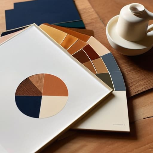
We’ve covered a lot of ground today, from demystifying the science of color theory to finding that perfect, sweet spot with complementary combinations. Remember, choosing a color scheme isn’t about following a strict set of rules or trying to make your home look like a showroom catalog; it’s about understanding how different hues interact to create a specific mood and flow within your rooms. Whether you decide to go bold with high-contrast pairings or keep things soft and serene with a monochromatic approach, the most important thing is that you have a solid foundation of knowledge to lean on when you start picking up those paint swatches.
At the end of the day, your home should be a reflection of your unique story, not a carbon copy of a trend you saw online. Don’t be afraid to make a little mess, test a few samples on your walls, and even change your mind halfway through—that’s all part of the creative process! I truly believe that once you start experimenting, you’ll find a sense of confidence that makes every project feel a little more like play and a little less like work. So, grab your brushes, trust your gut, and let’s bring your vision to life one beautiful color at a time!
Frequently Asked Questions
I'm so nervous about picking a color that looks great in the store but totally different once it's on my walls—how do I test samples properly?
Oh, I hear you! I used to get so much “paint anxiety” back when I was designing professionally. Here’s my golden rule: never, ever pick a color based on that tiny little paper swatch. Instead, grab a few sample pots and paint large squares directly on your walls. Check them at different times of the day—morning light is totally different from cozy evening lamp light. It’s all about seeing how that color actually lives in your space!
What should I do if my room has really weird lighting or doesn't get much natural sunlight?
Oh, I have been there! Dealing with a dark, moody room can feel a little daunting, but honestly, it’s just a creative challenge waiting to happen. If you’re lacking natural light, steer clear of cool grays—they can end up looking dingy and sad. Instead, lean into warm undertones or even soft, luminous neutrals to bounce what little light you do have around the room. Think of it as embracing the coziness!
How do I pick a color scheme that actually works with the furniture I already own so I don't have to replace everything?
Oh, I have been there! There is nothing worse than falling in love with a palette only to realize it clashes with your favorite velvet sofa. My secret? Start with your “anchor pieces”—those big items like your couch or a vintage rug that aren’t changing anytime soon. Pull a subtle undertone from their fabric or pattern to create your base. Once you have that foundation, we can build the rest of the room around it!
